 (Another guest blog from my dear friend and Scholastic Press Senior Editor Rachel Griffiths, who is entirely too modest about her editorial gifts in writing this post.)
"A charming little bonbon of a book.” That’s what Cheryl called My Invisible Boyfriend by Susie Day, a book I co-edited that just published on Scholastic’s Spring 2010 list. That’s it exactly, I thought, and spent so much time chattering to Cheryl about right she is, and how this book should be in everybody’s beach bag, and how it’s the kind of book that you read on the R train and embarrass yourself because you keep snorting with laughter and people look over worried about swine flu and other diseases you can catch on subways. I must have blathered a lot, because Cheryl offered once again to let me write a guest "Behind the Book."
Of course, what I really want to do is sit here and gush, because this is an adorable book – zippy, with awkwardness, wooing and a British boarding school completely full of glamorous misfits. But Cheryl’s Beyond the Books are so informative that even as an editor I learn something new each time. So this post is gushing plus information too – a case study in how to make a package that (I think) says "Pick Me Up, Please!"
One of the fun things about being an editor is that you get to work on all kinds of different projects. Right now, I’m editing The 39 Clues, a series about kids hopping around the world chasing a huge treasure; Kathryn Lasky’s new Wolves of the Beyond series about a wolf pup struggling to survive alone in the wild; a graphic novel about a superhero’s pets, and a host of others that I love. Cheryl and I, coming from the Arthur A. Levine School of editing, think about emotion first when we approach a book. The feelings a manuscript evoke are paramount for us.
And that’s how I approach a book’s package too. Each of the books on my list bring to mind a different mood. The little wolf story is deeply felt and written with profound respect for the natural world. And so the cover is realistic, a close up on a noble wolf alone in a vast wilderness. 39 Clues is full of action and danger, and so the covers are bright, vibrant, and with a lot of movement and motion lines.
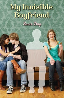
My Invisible Boyfriend is like a great pop song, and I wanted that flavor. Figuring out how to get a mood expressed as an image is beyond me, and my good luck here is that we have a great design team -- in this case Elizabeth Parisi and Becky Terhune. I asked them for a juicy cover, full of energy and a bit of humor, which would reflect how funny and awkward the book is. I also wanted a cover that would stand out on shelves. The YA section is currently overflowing with pale girls looking miserable and slightly ill (seriously, don’t vampires ever eat healthy people?), and this book is firmly YA, but has nothing paranormal about it. It’s outside the pack, and I wanted it to have that look – a splash of color in a sea of black. (Sometimes you advertise that you are different, and sometimes you want to make your book fit in. It depends on the book and your guess at the market. This book bucks the market trend, but I’m gambling here that some girls who like romance might be ready for a break from the supernatural.)
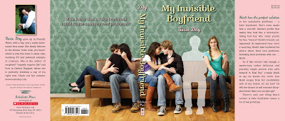
My first thought to get the book attention was to do a paper-over-board die-cut. I wanted the silhouette of a hot boy cut out of the board of the book, and no traditional jacket. But we tried a few covers like that, and nothing really popped. The cover looked like a gimmick and conveyed nothing of the flavor of the book. Then Becky came back to Elizabeth and me with a photo she’d found of a bunch of kids on a couch. What if we silhouetted one, she asked? The book has such a great ensemble cast, and the kids on the couch looked full of mischief and fun. The concept was perfect.
Unfortunately, the photo wasn’t. Occasionally our designers find a stock image that’s exactly right for a book, but in this case it was clear that we needed a photo shoot. So together, the designers and I picked models. We wanted attractive teens, but no one glamazon – we wanted to give readers the feeling that they could hop on the couch on the cover without anyone sniffing at them. So we cast our main character first, and then found others to fill in. (The photo shoot was a blast, by the way. There were five good-looking teenagers told to pretend to make out on a couch. The guys were flirting outrageously, and the couple on the right of the front cover ended up exchanging emails.)

So the cover was done, and now up to bat was the next part of the package – the flap copy. It was killing me. The list of cool things I wanted to convey was clear to me:
- The book has a very fun plot, in which the main character invents a boyfriend to gain acceptance from her friend. The neat thing is that Susie takes it farther than most books – her main character creates an Internet profile for her boyfriend, and her friends start writing to him.
- The book has a fabulous, fluttery love story and there is lots of romantic angst that gets resolved in a very satisfying way.
- It’s hilarious. (Reference the aforementioned subway snorting.)
Heidi has the perfect solution to her popularity problems – a fake boyfriend. She’s even made him a real-life Internet profile that makes him look like a motorcycle-wearing bad boy who reads poetry for fun. *swoon* Heidi’s friends are impressed. So impressed they start e-mailing Heidi’s fake boyfriend for advice about their own problems. Including their problems with, um . . . Heidi.To me, the result is a book package that announces the story within as the delicious treat it is. I hope we did justice to the deeply charming cast of characters Susie created, and more, I hope that it will catch teen eyes and make teen hands itch to grab it.
As if that weren’t bad enough, a mysterious, rather delicious and possibly single person who calls himself “A Real Boy” e-mails Heidi to say he knows the truth. Can Heidi escape from her (worldwide) web of lies before it’s too late? Or will her chance at real romance disappear faster than you can type gtg?
There’s only one thing that’s certain: A fake boyfriend causes a lot of real problems.
Thank you for taking the time to read this post.