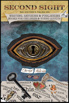
At the National SCBWI Conference in January, I was approached by an artist named Heidi Woodward Sheffield, whom I'd met once before at a conference in Michigan. She told me she loved Second Sight -- so much so that she'd designed some alternate cover concepts for it, which might better represent what she considered its complexities. After she sent them to me, I was fascinated by these alternate visions of how my book could have looked, and asked if I could share them here. Heidi replied:
If you could note how incredibly rough they are, especially the collage piece with the baby, locket and quotes from your book (too busy), and your name (illegible...). Please stress it was a concept piece and not a final. Photoshop has a sneaky way of looking too finished for conceptual work.
Here they are -- and aren't they beautiful?
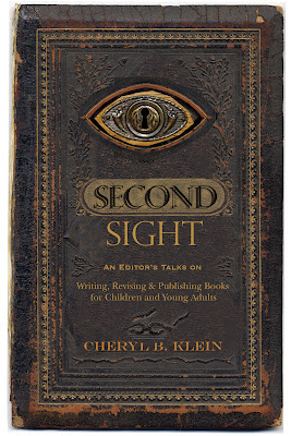

Looking at these alternate visions led me to reflect a little on why I went with the book cover I did, and the principles that drive my editorial decisions on a cover. Most of all, I want the covers of my books to convey, in both their text and images, a clear, straightforward message about what each book is, and for that to be an emotional message that will appeal to the book's most likely buyers. Thus I wanted to have books on the cover of Second Sight so you know immediately that this is a book about books, and then the large subtitle says clearly who this book is for (writers for children and YA) and why it is different (by an editor) -- all within a colorful, highly structured design whose feeling echoes my own rather structured writing style. If you're working on designs for your own book cover, you could do worse than to fill out the following questionnaire before you start:
- Who is my most likely audience of buyers? Of readers?
- What are the successful "comparison titles" for this book, which we might want to subtly remind that likely audience of? (I admit this question is how book cover trends get started.)
- What emotions are evoked in or by the book? In novels: What are the most high-drama scenes or resonant images that might make a great cover?
- Which of those emotions would I most like to convey to my likely audience? Which one would have the most appeal to them?
- How can I build an image or design that will put forward that feeling?
- How much of the appeal can be carried by the title, and how much has to be taken up by the visuals? How will the two play together?
- Where will this primarily be sold? (If online, it's important to think about how the image will look scaled down to an inch onscreen.)
Thank you again, Heidi, for letting me share these!